



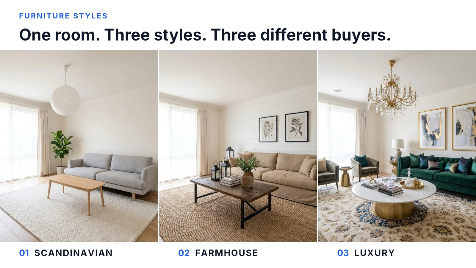
Before a virtual staging tool does anything, it asks which style you want. Stagify gives you seven, plus a custom prompt. Most people answer the way they’d answer for their own living room and pick the one they like best. But you’re not the one who has to be convinced. The photo is going to be looked at by a stranger scrolling a portal at speed, deciding in about a second whether this is the sort of house they’re looking for, and the style is there to make that answer come out yes.
Staging works by recognition
The effect itself is well documented. In the National Association of Realtors’ 2025 Profile of Home Staging, 83% of buyers’ agents said staging made it easier for a buyer to envision a property as their future home. The word doing the work there is envision. Furniture in a listing photo is a sketch of a life, and the buyer is quietly checking whether it could be theirs.
So a style can miss in two ways. It can miss the buyer, like a mid-century sideboard in a suburban family house that’s going to be bought by people with a double buggy in the hall. Or it can miss the building, like a coastal palette in a Victorian terrace with high ceilings and original cornicing, where the furniture and the room are visibly arguing. The second one does more damage, because it reads as fake. A buyer who can’t say why a photo looks off will just keep scrolling, and you’ll never learn that the reason was the sofa.
The photograph has already narrowed it down
Before you open the style picker, look at what the room has told you. Four things in the photo will usually take seven options down to two or three.
- The architecture. Cornicing, panelled doors, a picture rail, a fireplace with a period surround: those are instructions. So is their absence. Flat ceilings, square openings and plain skirting say the house was built recently and will take almost anything.
- The floor. A dark stained board, a pale engineered oak and a beige carpet are three different starting palettes, and the furniture has to sit on whichever one is actually there. This is the mismatch people make most often, because the floor is the largest coloured surface in the frame and it’s easy to look straight past.
- The light. A north-facing room with one small window goes cold and grey very quickly under a pale, minimal palette. Warm wood and textile do the opposite. What reads as restrained in a sunlit room can read as unheated in a dim one.
- The ceiling height and the floor area. Low ceilings and a small footprint punish heavy, tall, dark furniture. A big room with height swallows anything delicate and comes back looking underfurnished.
None of that is a matter of taste, and all of it is sitting in the photograph you’re about to upload. Read it first.
The seven, and what each one is for
The names are conventions rather than definitions, so here’s what each one does to a listing photo, which property it agrees with, and how it tends to go wrong.
Standard. Deliberately unmemorable: mid-tone upholstery, simple wooden legs, nothing that dates. It’s the right default and it gets picked far less often than it should, mostly because it doesn’t photograph like an interiors magazine. Use it when the buyer pool is broad and unknown, when the house is being sold on its size, layout or location, and any time you honestly can’t tell who the buyer is. The only real cost is in a distinctive property, where it wastes the character you’re selling.
Modern. Low, clean-lined, restrained palette, very little on the surfaces. It agrees with flat ceilings, big windows, open-plan ground floors and new build, which makes it the natural partner to a house that doesn’t physically exist yet and has no existing decor to contradict. It struggles in a small, dim or heavily detailed room, where minimal starts to read as empty and the result looks repossessed rather than styled.
Midcentury. Tapered legs, walnut, mustard and olive, a strong graphic line. It’s the most specific style on the list and the riskiest for that reason, because it dates the fantasy as well as the furniture. Good for a genuine post-war house, a city flat, an architect-designed property, or a buyer shopping for character. Bad in a family house in the suburbs, where it quietly says this home is for somebody without children.
Scandinavian. Pale wood, light grey and off-white textiles, restrained, plenty of visible floor. Its practical virtue is that it makes rooms look bigger and brighter than almost anything else, which is why it’s the safe pick for small flats, box rooms and anything aimed at first-time buyers. The trap is the north-facing room above. All that grey and white with no sun on it goes from calm to cold in one step.
Coastal. Blues, whites, linen, light woods, a holiday feeling. This one depends on geography in a way the others don’t. Within sight of water it’s doing real work, because it’s selling the reason the buyer is looking in that area at all. Forty miles inland it’s a theme, and buyers tend to read themed staging as a distraction from something.
Farmhouse. Warm, textural, a little rustic: linen, reclaimed wood, woven rugs, black metal. It’s the most forgiving style for older houses with visible character, and it photographs warm in the same rooms where Scandinavian photographs cold. The risk is clutter, since the style’s whole vocabulary is objects and objects are what a listing photo has least room for. Keep it sparse.
Luxury. Velvet, marble, brass, layered rugs, a statement light. At the top of the local market it’s the right answer, and it’s also the most over-chosen style in virtual staging, because it’s the most fun to generate. Staging a house a full price band above where it will actually sell doesn’t lift the price. It sets up an expectation that the front door, the kitchen and the street then fail, and a buyer who turns up to a viewing feeling misled has already made a decision.
The rooms that earn the decision
Not every room repays a considered style choice. NAR’s 2025 figures are a fair guide to where the attention goes: the living room (91%), the primary bedroom (83%), the dining room (69%) and the kitchen (68%) are the rooms agents stage, while guest and children’s bedrooms sit far behind at 22% each.
For style purposes that list splits in two. The living room, the primary bedroom and the dining room are furniture rooms, where the style choice is most of the photograph and worth thinking about. Kitchens and bathrooms are structure: cabinetry, worktops, tiling, appliances. Staging can add a bowl of fruit and a folded towel and not much else. They rank high because buyers care about them, not because staging changes them. Put the effort where the furniture is.
Two room types sit outside that ranking. Outdoors covers a patio, a balcony or a bare deck, and it responds better to staging than almost anything indoors, because an empty slab is genuinely hard to read and two chairs and a table turn it into a room. A dorm or student let is its own category, where the occupant isn’t buying anything and the brief changes completely.
One style for the whole listing
The mistake that survives every good individual decision is choosing room by room. Nobody looks at your living room photo on its own. They look at the gallery, in order, in about fifteen seconds, and they read it as one house. A Scandinavian living room, a Farmhouse dining room and a Luxury primary bedroom don’t read as three good photographs. They read as a house where something is off, and the explanation a buyer reaches for is that the photos aren’t all of the same property.
Pick the style at the listing level, before the first photo, and hold it across every room. This is also the argument for doing the removal pass first and keeping the emptied files. Once you have a clean set of empty rooms, restaging the whole listing in a different style is minutes of work rather than a decision you had to get right first time.
When none of the seven fits
Two cases fall outside the presets, and each has its own tool.
The first is a property the list doesn’t cover: a converted chapel, a period apartment that needs one particular palette, a room that has to show a home office and a guest bed at once because that’s what the listing is selling. Custom exists for this. Describe the furnishing in your own words instead of picking a label, and write it the way you’d brief a stager, naming pieces, materials and colours rather than adjectives. “A low walnut sideboard, two olive armchairs, a cream wool rug” gets you a room. “Cosy and inviting” gets you whatever the model averages those words to.
The second is when the style is right and one object is wrong. You don’t need to regenerate the whole room for that. The Masking Studio takes a single area and changes only that: swap the sofa, drop the rug, put a desk in the alcove, leaving the rest of the photograph exactly as it was. Regenerating a whole room to fix one chair is how you lose a good photo.
Then just try three
All of the above narrows the field without settling it, and it doesn’t have to, because the economics aren’t the economics of physical staging. A stager commits you to one look for the length of the listing, which is most of the reason the staging bill is what it is. A generated room comes back in about eight seconds and costs nothing to redo.
So in practice:
- Read the photo. Architecture, floor, light, ceiling height. That takes three or four of the seven off the table straight away.
- Name the buyer. First-time buyer, downsizer, family, investor. Say it out loud, and it usually removes one more.
- Generate the survivors on the same room. Two or three styles, one photograph, side by side. A mismatch that was invisible in the abstract is obvious in the comparison, which is what the picture at the top of this article is.
- Pick one and apply it to every room. Consistency beats the marginally better choice in any single photo.
- Label the photos. A staged image is an edited image and has to be disclosed as one.
That last step isn’t optional and doesn’t depend on which style you chose. Virtually staged photographs have to be labelled, most MLSs require it, and in California it’s statute. The state-by-state position is here.
Sources & notes
- NAR: Report Reveals Home Staging Boosts Sale Prices and Reduces Time on Market (May 2025), reporting the 2025 Profile of Home Staging. Source for the 83% of buyers’ agents who said staging made it easier for a buyer to envision the property as their future home, and for the staged-room percentages (living room 91%, primary bedroom 83%, dining room 69%, kitchen 68%, guest and children’s bedrooms 22% each). Survey methodology: 49,806 Realtors invited, 1,266 usable responses, a 2.5% response rate, collected February 2025.
- No research shows that one furniture style outsells another. Nobody has run that study, and this article isn’t pretending otherwise. Everything here about which style suits which property is craft, the reasoning listing agents and stagers use, offered as reasoning you can check against your own photograph rather than as a measured result. The one measured claim is the 83% above, and it’s about staging in general, not about any style in particular.
- The “about eight seconds” figure is Stagify’s own typical generation time on the default model, not an industry benchmark. Complex rooms and heavily detailed styles take longer.
- Staging costs, the occupied versus vacant split and the case for buying the consultation are sourced in The Median Staging Bill Is $1,500, where the citations live.
- Disclosure requirements for virtually staged photographs, including California’s statute, are covered with citations in Do You Have to Disclose Virtual Staging?
- The three photographs at the top of this article are one room in three styles. All four images, the empty room and the three staged versions, were produced with Stagify. The empty room was generated, then staged three times from that same file, with nothing retouched by hand afterwards.